Brand guidelines
One word, one wedge.
How to use the Kanesh logo, colour, type and voice. Everything here is built from the files you can download at the end.

One corner wedge makes the k.
The arms of our k are a single corner wedge, the Winkelhaken: one of the basic impressions of cuneiform writing.
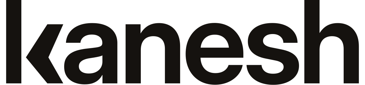
- The wordmark is “kanesh” in lowercase Inter, weight 640, tracking −0.035 em, with one drawn letter.
- The wedge is detached from the stem the way a stylus lifts off the clay. Never reconnect it.
- The small cut (weight 690, gap 0.46 × the stem) keeps the k open at 12–14 px.
- The symbol is the k on its own. It lives only in square and round slots, never beside the wordmark.
- The stem: Inter's own stem and ascender.
- The gap: 0.30 × the stem, so the wedge stays detached.
- The arms: one corner wedge, tips cut horizontally.
Logo
The wordmark alone is the logo. It is outlined geometry: use the files, never retype it.
Wordmark
The logo. Site header, documents, invoices.
On dark
Bone on night or ink.
Small cut
Below 120 px wide: footers, signatures, UI.

Endorsed
“by Nexau”, for the first year.
App icon and favicon
The ink k centred on a white circle, with a hairline ring so it holds on light and dark tabs.
Avatar
WhatsApp, Instagram and Meta profiles. The platform crops the circle.
Clear space
Leave half the x-height clear on every side.
½ x-height
Minimum sizes
- Wordmark120 px wide
- Small cut56 px wide
 Symbol (favicon cut)16 px
Don't
Don't: Put the k symbol in front of the wordmark.
Don't: Reconnect the k's arms to its stem, or open the wedge into a thin chevron.
Don't: Re-set the wordmark in live text.
Don't: Use clay for small text. Use clay-600.
Don't: Add a gradient, shadow or outline.
Colour
Warm neutrals and one clay red, used as a precise accent. Contrast is WCAG 2.x for the values shown.
- clay
#C9441D
Fills: primary button and highlighted data
Contrast: White on clay 4.85:1 · clay on bone 4.42:1, fills and large marks only
- clay-600
#A83219
Accent text and links on light
Contrast: 6.11:1 on bone · 6.70:1 on white
- ember
#E0531F
Accent on dark
Contrast: 4.50:1 on night
- ink
#15120F
Wordmark and text
Contrast: 17.0:1 on bone · 18.7:1 on white
- bone
#F7F4EF
Page; reverse wordmark
Contrast: 15.9:1 on night
Supporting neutrals
- night #1E1915Footer, one dark band
- sand #EFE9DFOne tinted section per page
- stone #5E554CMeta and captions
- line #E6DFD5Hairlines
- paper #FFFFFFCards and product UI
- Clay is a fill: the primary button and one highlighted datum. At most one clay button per screen.
- Lapis, moss and saffron appear only inside product visuals, for status (AI, success, attention).
- The website's page base is a lighter bone, #FAF8F5.
Typography
Two open-source families on the site, self-hosted. Six sizes and three weights, no more.
Bricolage Grotesque
Headings · weight 480, optical size 48
Your customers see one brand. Operate like one.
Figtree
Text and UI · weights 400, 500 and 600
When the AI shouldn't answer, it hands the conversation to your team with the reason and context.
Scale
- display · 40 → 64 pxBricolage 480 · one per page
- h2 · 32 → 44 pxBricolage 480 · section headings
- h3 · 18 → 20 pxFigtree 600 · card and feature titles
- lead · 17 → 18 pxFigtree 400 · one per section, ≤ 140 characters
- body · 16 pxFigtree 400 · everything else
- small · 14 pxFigtree 500 · labels, meta, buttons
The wordmark is drawn from Inter (OFL) and outlined, so no extra font is needed to show it.
Icons and motion
Lucide outline icons, quiet and neutral. Motion explains; it never decorates.
- Stroke 1.5. Two sizes: 16 px inline, 20 px in lists.
- Ink in lists and menus, stone when decorative. Never clay.
- In a 32 px neutral tile when an icon needs a container.
Never
- Robots, glowing brains or holograms.
- Stock photos of people on headsets.
- Channel logos as decoration.
- Customer data shown without permission.
Motion
- 1 per viewOne moving thingOnly the product visual moves.
- 150 msControlsButtons and menus ease out.
- > 5 sDemosStart from a complete frame, play only while visible, and can be paused.
- 0 msReduced motionprefers-reduced-motion shows the final state.
Voice and tone
Precise, calm, commercial, direct and responsible.
- Precise
- Calm
- Commercial
- Direct
- Responsible
Your customers see one brand. Operate like one.
Tus clientes ven una sola marca. Opera como una.
| Rule | English | Español |
|---|---|---|
| Person | “you”, “your team” | tú (neutral for Spain and Latin America); never vosotros |
| Case | Sentence case | Sentence case |
| Numbers | €59.00 · 1,200 | 59,00 € · 1.200 |
| CTA | Get a diagnosis | Pide tu diagnóstico |
| Say | “hands over to your team with context” | «pasa a tu equipo con el contexto» |
| Don't say | “AI employees”, “autonomous”, “revolutionary” | «empleados de IA», «autónoma», «revolucionario» |
Spanish is written natively, not translated. English is native US-leaning. No exclamation marks in marketing copy.
Downloads
Vector files (SVG) and PNGs. Logo files never contain live text.
Wordmark




Small cut and endorsed






Need another format? Write to us. info@nexau.es